Admin
Admin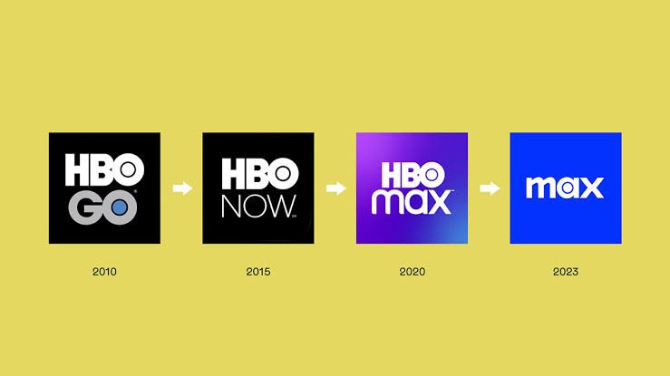
The hbo max logo is one of the most recognizable marks in modern streaming. It represents a major entertainment platform with movies, shows, documentaries, and original programs. The logo has also changed as the streaming service developed its brand. Each design reflects a different stage in the company’s story. Understanding these changes makes the logo more interesting than it first appears.
A good streaming logo needs to be simple and easy to remember. It should look clear on phones, televisions, websites, and app icons. The HBO Max branding follows many of these ideas. Its lettering creates a strong visual identity without needing a complicated picture. This makes the logo easy to recognize at a quick glance. In this guide, we will explore its history, design, colors, meaning, and major changes. We will also explain why the logo works well across digital platforms.
What Is the HBO Max Logo?
The hbo max logo is the visual identity associated with the HBO Max streaming service. It uses lettering as its main design element. This approach keeps the brand easy to identify across different screen sizes. The logo has appeared on streaming applications, websites, promotional materials, television interfaces, and other digital products.
The HBO name already had a long history in entertainment before HBO Max launched. Adding “Max” created a newer identity for a broader streaming service. The combined name helped connect the established HBO brand with a larger entertainment library. The logo therefore needed to feel familiar while also appearing modern. Simple typography helped achieve this goal. It avoided unnecessary shapes and decorations. The result was a clean streaming identity that could work in many places. Today, people often recognize the HBO lettering before reading the complete service name.
The History Behind the HBO Max Branding
The hbo max logo was introduced when HBO Max launched as a streaming platform in 2020. The service was created to bring HBO programming together with additional entertainment content. Its branding needed to distinguish the new service from traditional HBO television offerings.
The original identity used the familiar HBO wordmark alongside the word “max.” This helped viewers connect the new platform with HBO’s established reputation. Over time, the service went through major corporate and branding changes. These developments eventually led to the HBO Max name returning after a period when the platform was called Max. Logo changes followed these brand decisions. This history shows how a logo can reflect business strategy. A visual identity is not simply decoration. It can communicate how a company wants people to understand its product. The HBO Max journey is a clear example of this relationship between branding and entertainment.
Why the HBO Max Logo Looks So Simple
The hbo max logo uses a simple visual approach because simplicity works well in digital spaces. Streaming platforms appear on many devices. A logo may be displayed as a tiny app icon or a large television graphic. Complicated artwork can lose clarity when reduced in size.
Simple lettering remains readable under many conditions. It can also work well beside menus, buttons, posters, and promotional graphics. This flexibility is especially important for a streaming service. Users may see the logo several times during a single viewing session.
Another advantage is memorability. People can remember simple shapes and letters more easily. The HBO wordmark already has strong recognition. Combining it with the Max name created a recognizable streaming identity. This balance between familiarity and simplicity helped the brand stand out in a crowded entertainment market.
Understanding the HBO Max Logo Design
The hbo max logo is primarily based on typography rather than an illustrated symbol. The HBO portion uses the company’s familiar visual style. The Max portion provides the newer streaming identity.
Typography plays an important role in brand design. Letter spacing, weight, proportions, and arrangement can change how a logo feels. A clean wordmark can appear modern and professional. It can also remain useful for years because it does not depend heavily on temporary visual trends.
The design is particularly useful for digital branding. It can be placed on websites, smart television screens, mobile apps, social profiles, and advertising. Designers can also adapt a wordmark for different layouts. This gives the brand more flexibility. Instead of depending on a complex picture, the identity relies on recognizable lettering. That makes the logo practical for both large and small applications.
HBO Max Logo Colors and Their Role
Color is an important part of the hbo max logo and its surrounding brand identity. Strong colors can help a streaming platform create an emotional connection. They can also make an application easier to recognize among many icons.
The branding associated with HBO Max has used rich and distinctive color treatments. Purple became strongly connected with the HBO Max identity. The color helped separate the service from many competitors. It also created a modern entertainment feel.
Colors can behave differently on various screens. Television displays, mobile phones, tablets, and computer monitors may show shades differently. Professional brand systems therefore consider consistency across multiple devices. The goal is not simply to choose an attractive color. The color must also support recognition. HBO Max’s visual identity demonstrates how color and typography can work together to create a memorable streaming brand.
What Does the HBO Max Logo Represent?
The hbo max logo represents a connection between HBO’s established entertainment identity and its streaming-focused expansion. The word HBO carries decades of recognition. The Max name suggests a broader entertainment experience.
A successful logo does not need to explain an entire business. Instead, it provides a visual shortcut. When viewers see the logo, they can quickly connect it with movies, series, original productions, and streaming entertainment.
The logo also represents change. HBO began as a premium television service. Streaming later became a major part of how people watch entertainment. HBO Max was designed for this changing environment. Its visual identity reflected the move toward digital viewing. The branding therefore became part of a larger story about entertainment consumption. People moved from scheduled television toward on-demand libraries. The logo helped identify the service within that new viewing experience.
How the Logo Has Changed Over Time
The hbo max logo has changed as the streaming platform’s name and strategy changed. HBO Max launched with its own identity in 2020. The service later adopted the shorter Max name in 2023. In 2025, the HBO Max name returned.
These changes demonstrate an important branding lesson. A logo often follows a company’s naming strategy. When a product changes its public name, its visual identity may also need to change. This helps prevent confusion among customers.
Brand changes can also affect audience recognition. Viewers who already know HBO may respond differently to a familiar HBO-based identity. Meanwhile, newer viewers may associate the Max name with a broader streaming catalog. The return to HBO Max connected the platform with the HBO brand again. These transitions make the logo’s history especially interesting for people who study entertainment branding.
HBO Max Logo on Streaming Apps
The hbo max logo has an important role in app design. Streaming users often choose services from small icons on mobile devices or television menus. A recognizable mark can make that process easier.
App logos need to remain clear at small sizes. Tiny text can become difficult to read. Strong visual contrast and simple shapes can help maintain recognition. The HBO Max identity benefits from its short and familiar wording.
The logo may also appear alongside hundreds of other applications. Streaming devices can contain services for sports, movies, music, news, and games. A recognizable brand mark helps users locate the service quickly. This is one reason digital logos require careful design. They must work within crowded interfaces. A logo that looks attractive on a billboard may not work equally well as an app icon. Streaming brands must consider both situations.
HBO Max Logo and Brand Recognition
The hbo max logo supports brand recognition by combining familiar HBO branding with a streaming identity. Recognition is valuable because viewers have many entertainment choices. A clear logo helps people identify a service without reading long descriptions.
Brand recognition develops through repeated exposure. Viewers may see a logo during advertisements, trailers, app launches, website visits, and television menus. Over time, the visual mark becomes connected with the service.
Consistency is another important factor. When typography, colors, and logo placement remain consistent, audiences can build stronger associations. Major branding changes can temporarily interrupt those associations. However, established names can also make transitions easier. HBO already had significant recognition before HBO Max launched. This gave the streaming service an existing visual foundation. The logo therefore worked as part of a much larger brand system.
HBO Max Logo Versus the Max Branding
The hbo max logo became especially interesting when the service temporarily used the shorter Max name. The change reduced the connection between the streaming platform and the HBO name in its primary public identity.
Max was positioned as a broader entertainment service. The shorter name was designed to represent content beyond HBO programming. This included movies, series, reality content, animation, and other entertainment.
The later return of the HBO Max name changed that branding direction. The HBO name again became central to the service identity. This illustrates how brand names can communicate strategy. A company can use branding to emphasize either heritage or expansion. Neither approach automatically works for every audience. The key issue is how customers understand the service. HBO Max’s naming journey provides a useful case study for digital marketing and entertainment branding.
How the HBO Max Logo Works in Marketing
The hbo max logo is used in many forms of marketing. It can appear in television commercials, digital advertisements, social media posts, movie promotions, and streaming interfaces. Its simple structure makes it adaptable.
Marketing teams often need logos that work across different formats. A promotional poster may provide plenty of space. A mobile advertisement may offer only a small area. A television commercial may display the logo for just a few seconds.
A recognizable wordmark can handle these differences. It does not require viewers to study complex artwork. Instead, they can identify the brand quickly. This is especially useful in entertainment advertising, where many logos and titles compete for attention. Strong branding can help audiences understand which company or service is presenting the content.
Is the HBO Max Logo Copyrighted or Trademarked?
The hbo max logo is part of a commercial brand identity. Logos, names, and related brand elements may receive legal protection through trademark and copyright laws. The exact protection depends on the specific element and jurisdiction.
People should not assume that a logo is free to use simply because it appears online. Commercial brands generally control how their trademarks are used. This is important for bloggers, designers, marketers, and website owners.
If you want to use the logo, check the brand’s current official guidelines and applicable laws. Rules can also differ depending on whether the use is editorial, educational, commercial, or promotional. When creating original content, it is safer to use your own graphics rather than altering a company’s official logo. Proper brand usage helps avoid confusion and protects the identity of the original brand.
Why People Search for the HBO Max Logo
People search for the hbo max logo for many reasons. Some users want to identify the correct streaming app. Others may need branding information for research, design studies, or articles.
Designers may study the logo to understand typography and visual identity. Students may use it as an example of brand evolution. Entertainment fans may simply want to compare older and newer versions.
Search interest can also increase when a streaming service changes its name. A new identity creates curiosity about the differences between old and new branding. People may want to know whether they have the right application or service. This makes logo searches useful beyond simple image discovery. They can reveal how customers interact with digital brands.
Tips for Understanding Streaming Logo Design
The hbo max logo provides several useful lessons for anyone interested in branding. First, a logo should remain recognizable at different sizes. Second, typography can create a strong identity without complex artwork.
Third, color can support recognition. A distinctive color palette can help users identify a brand quickly. Fourth, consistency matters across websites, apps, advertisements, and social media.
Finally, a logo should support the larger brand message. A streaming company needs an identity that feels appropriate for entertainment. It also needs enough flexibility for changing technology and platforms.
These lessons apply to many businesses. A small company can use the same basic principles when developing its own logo. Good branding does not always require complicated design. Often, a clear idea and consistent presentation create the strongest results.
The Future of HBO Max Branding
The hbo max logo may continue to evolve as streaming technology and entertainment habits change. Digital platforms constantly adjust their products, interfaces, and marketing strategies.
Future branding may need to work across televisions, phones, tablets, cars, gaming systems, and other connected devices. This makes flexibility more important than ever.
A successful identity should remain recognizable while allowing room for innovation. HBO Max has already experienced several major naming and branding stages. Those changes show that logos are living parts of a business identity. They can change when audiences, products, and strategies change. Watching future developments can therefore provide useful insight into how major entertainment brands adapt to the digital market.
Frequently Asked Questions About the HBO Max Logo
1. What is the HBO Max logo?
The hbo max logo is the visual identity used for the HBO Max streaming service. It combines the established HBO identity with the Max name.
2. When did HBO Max launch?
HBO Max launched in 2020 as a streaming service. It brought HBO programming together with additional entertainment content.
3. Did HBO Max change its name?
Yes. The service changed its public name to Max in 2023. The HBO Max name returned in 2025.
4. Why is the HBO Max logo simple?
The hbo max logo uses a relatively simple wordmark because it needs to work across many digital formats. Simple designs remain easier to recognize at different sizes.
5. What color is associated with HBO Max?
Purple became strongly associated with the HBO Max visual identity. Color treatments can vary across branding materials and applications.
6. Can I use the HBO Max logo on my website?
Use caution when displaying commercial logos. The hbo max logo can be protected by intellectual property rights. Check current brand guidelines and applicable laws before using it commercially.
Conclusion
The hbo max logo is more than a simple collection of letters. It reflects the development of a major streaming brand. Its design connects the established HBO identity with the modern world of on-demand entertainment. The logo has also changed as the service moved through different naming and branding stages.
For viewers, the logo makes the service easier to recognize. For designers, it provides an interesting example of typography, color, and brand consistency. For marketers, its history shows how visual identity can change with business strategy. Understanding these details gives us a better view of why familiar logos matter. As streaming continues to evolve, the HBO Max brand will remain an interesting example of digital entertainment branding.